Stop the Scroll: Why Retrofitting 16:9 Assets for Vertical Video Fails to Convert
Every marketing team has tried this shortcut at least once. You wrap a major commercial or brand campaign shoot. The production value is incredible, the widescreen 16:9 cinematic framing looks flawless on a monitor, and the budget is spent. Then comes the social media distribution ticket: "We need vertical versions for Instagram, TikTok, and LinkedIn."
The standard fix is quick: you throw the horizontal master into a 9:16 timeline, scale it up by 300%, and manually slide the frame left and right to keep the subject centered.
On paper, you've checked the box for mobile asset distribution. In reality, you've just created a jarring, compromised user experience that social media consumers reject instantly. Retrofitting widescreen footage for mobile feeds doesn't just look awkward; it actively destroys your conversion rates. If your brand wants to build actual authority on mobile feeds, you have to stop treating vertical video production as an afterthought in the editing room and start treating it as a distinct creative framework on set.
The death of intention: how cropping ruins your composition
Cinematography is an art form based on spatial balance. When a director and a director of photography (DP) compose a widescreen shot, they utilise the entire horizontal landscape to guide the viewer's eye. They use negative space, lead room (the space in front of a moving or talking subject), and environmental details to establish depth and subtext. When you forcefully crop that image into a vertical box, you strip away the intentional composition.
- Severed lead room. A talking subject elegantly positioned on the left third of a widescreen frame is suddenly shoved against the edge of a vertical box. Their nose is practically touching the side of the screen, creating an anxious, claustrophobic visual that breaks basic editorial standards.
- Microscopic product focus. If your widescreen shot featured a subject holding a product at chest level, cropping into their face means the product drops out of the bottom of the vertical frame. To show the product, you have to pan down, losing the human expression entirely.
- The "uncanny valley" pan-and-scan. Digitally sliding a frame to keep up with action feels artificial. The human eye easily detects the difference between an organic camera tilt and a digital asset being dragged across a timeline, labelling the content as cheap and automated.
The text overlay and interface trap
When you publish a native piece of vertical content, it doesn't live in a vacuum. It lives underneath a dense layer of platform-native user interface (UI) elements. TikTok, Instagram, and YouTube Shorts wrap their icons (likes, comments, shares, audio tracks) along the right-hand margin. Captions, hashtags, and system search bars sit across the bottom third.
When you scale up a widescreen 16:9 video to fit a vertical screen, your critical visual elements inevitably spill into these platform blind spots. Text overlays clash with native captions, faces end up hidden behind "Share" buttons, and brand logos are obscured by profile pictures. A dedicated mobile production workflow maps out these safe zones before the cameras are even plugged in, so every graphic, face, and product interaction sits squarely within the safe viewport.
The pacing incongruency
The visual geometry of a video directly influences how our brains interpret its pacing. Widescreen video invites the eye to linger, scan the horizon, and absorb environmental details. It naturally accommodates slower, more atmospheric editing cuts. Mobile feeds move at an entirely different velocity. A vertical scroll is a hyper-fast, low-friction gesture, so the visual narrative has to deliver high information density from the very first frame.
If you take a cinematic, slowly paced 16:9 commercial and slap it into a vertical feed, the pacing feels painfully sluggish. The opening panoramic shot that felt majestic on desktop looks like frozen static on mobile. The viewer has scrolled past your ad long before your subject even enters the frame. Native vertical video builds momentum from frame zero, using kinetic camera work, rapid framing adjustments, and immediate thematic hooks engineered for the short-attention economy.
The strategic solution: the dual-axis production framework
Protecting your budget doesn't mean shooting two completely separate campaigns. Premium agencies avoid the cropping disaster by implementing a dual-axis production framework during pre-production and on set.
| Production strategy | How it works | The final benefit |
|---|---|---|
| Cross-axis storyboarding | Every frame is drawn with both a 16:9 box and an overlapping 9:16 box inside it. | Assures the narrative logic works perfectly across both aspect ratios simultaneously. |
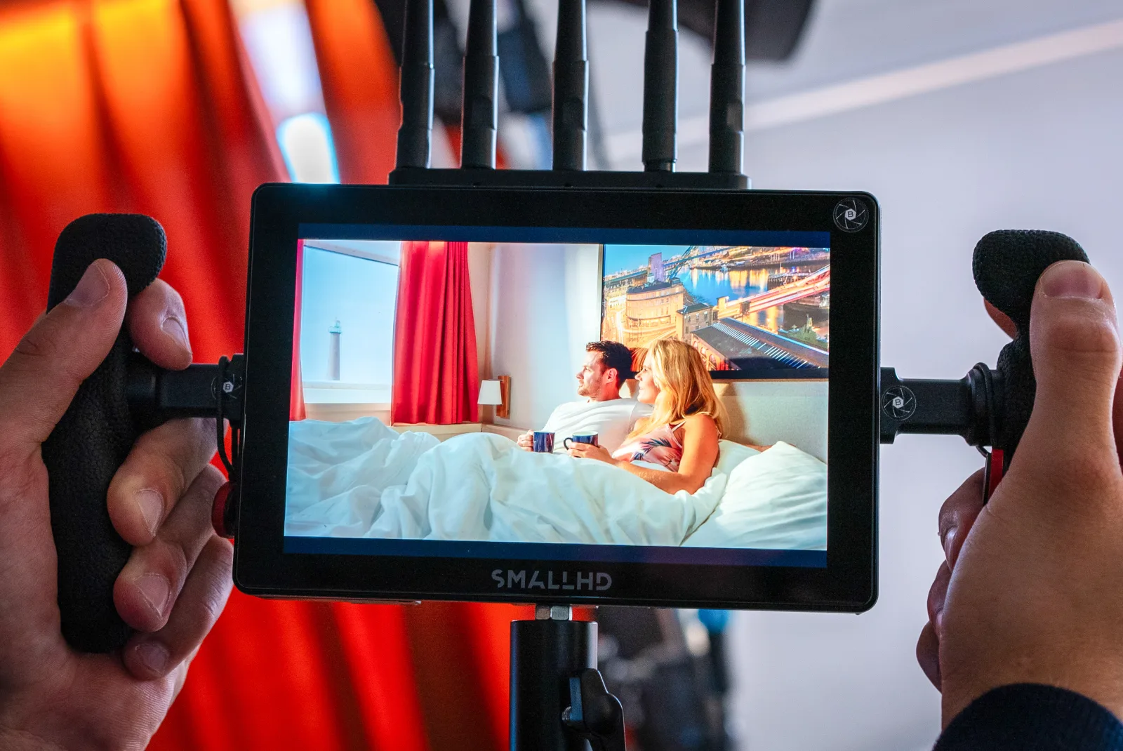
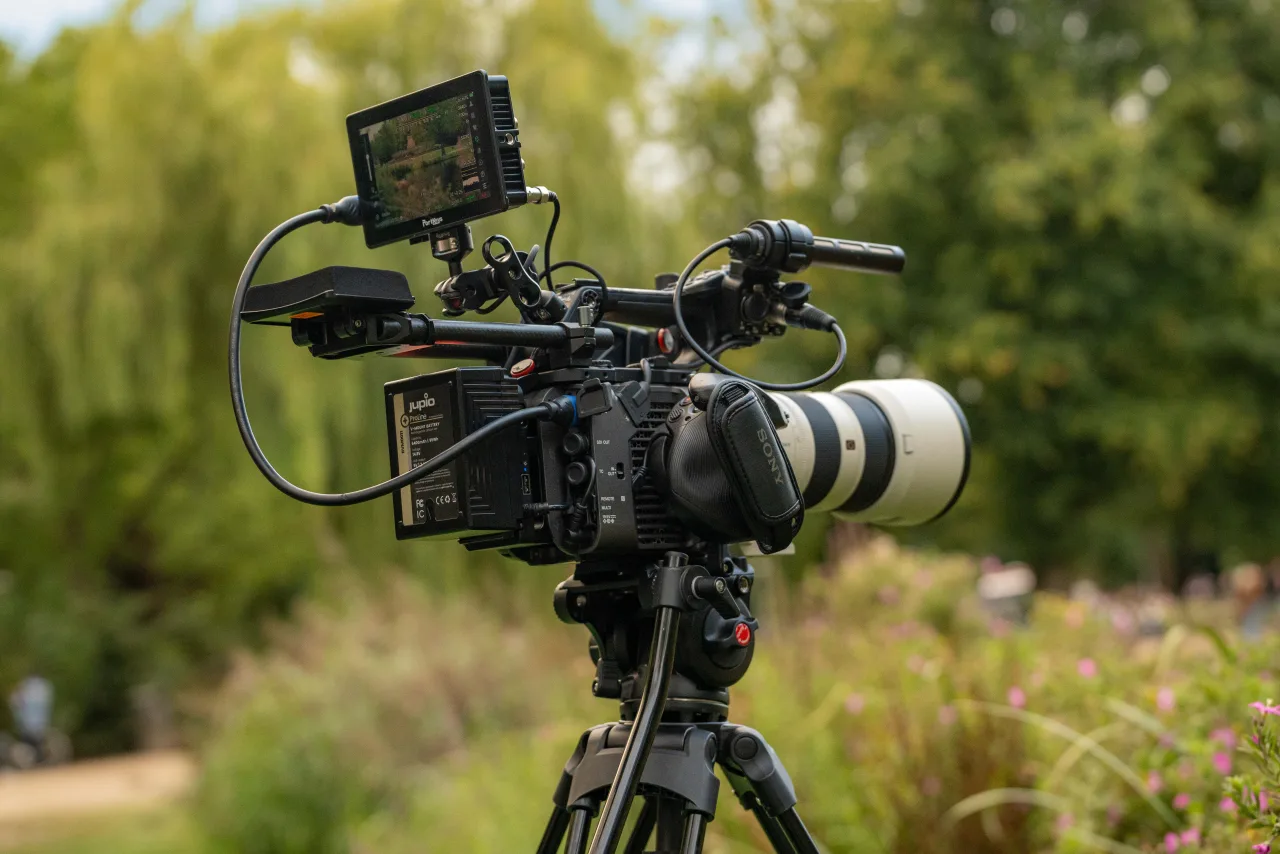
| Open-gate capture | Shooting on large-format cinema sensors at maximum resolution without pre-masking. | Provides clean, uncropped, ultra-high-resolution pixel density for both assets. |
| Dual-monitor on-set preview | The director and client view live feeds with electronic frameline overlays for both layouts. | Guarantees no product or face sits outside the platform safe zones during active takes. |
By prioritising the unique architecture of the smartphone screen during planning, your brand eliminates the need for awkward post-production crops. You wind up with a master cinema commercial that commands authority on wide displays, paired with a library of vertical assets that feel entirely native, intentional, and non-skippable on the feed.
Stop compromising your social media authority with stretched, scaled, and cropped content. Let's collaborate on a native mobile video architecture that turns passive scrollers into active conversions.
Get in touch